Tuesday 1 May 2012

Final packaging


My two final pieces for the packaging brief, i couldnt decide which one i liked the most.

Monday 23 April 2012

reading list


  • Obey the giant: Life in the image world                                                      Rick Poynor, Birkhäuser, 2007
  • Mythologies                                                                                        Roland Barthes, Paladin, 1973
  • www.wgsn.com 
  • Graphic: Inside the Sketchbooks of the World’s Great Graphic Designers Steven Heller and Lita Talarico, Thames & Hudson, 2010
  • Advanced photoshop magazine
  • creative arts magazine

Thursday 22 March 2012

3 images that never fail to impress me

 This photo was done purely with differing shutter speeds, it has never seen photoshop. i think that is amazing and the out come is awesome!
 When i first saw this i realised id been staring for ages just blown away at how awful the scene was. The level of detail is staggering, i hope i can be a fraction that good one day!
This is one of my all time favourite images and was my desktop wallpaper for a while, it just never fails to make me smile! i love the knights expression and how the dragon looks really upset!

Wednesday 21 March 2012

Final font design


here is the final font i created. im really pleased with this. i based it on the Ariel font because this is going to be mainly used for signs and packaging so needs to be legible from a distance. that is what Ariel was for, being legible even when its minimised tiny on the screen. I like the way that this is playful, almost cartoonish but i think it has an air of business about it as well.

Tuesday 20 March 2012

Packaging brief

We got our new brief today and im really excited, we have to design our own packaging for fred aldous, we design a font for them recently and i completely forgot to put it on so ill add the finished font. to be honest bruno maag makes his fonts look really simple and it doesnt look like there is much work involved but to be honest its really hard! i am really pleased with my final outcome though. anyway here is our new brief.


BACKGROUND
Brief:
You are required to produce and submit the following;

1.     A body of research into innovative packaging, this must be presented in a series of A3 sheets “not in a sketch book”

2.     Produce evidence of exploring materials that could be utilised to achieve an innovative packaging solution. Make reference to your research outcomes from being allowed access to the WGSN resource, this resource is only available whilst on campus so please research and investigate this site before you break for Easter.

3.     A working prototype of your innovative packaging solution including all type that is required on the packaging.

4.     There is no budget restriction on materials currently as the client wants ideas that can be modified if they put them into production.

5.     Type to be included on the packaging is as follows “Fred Aldous’s Flower Press” you can use any images that you want on the packaging as long as you have created them.

6.     Your packaging solution must fit into the provided standard sized postal box as supplied by the client, see sample at briefing you will have to make a note of the dimensions by measuring the box in the studio.

7.     The client does not want any plastic used in the packaging.

8.     The final design must use your own font design from the previous project BUT you can use other supporting fonts in addition.


Saturday 17 March 2012

Angel WIP


Another digital painting im working on, to be honest this was only intened as a bit of practice with angle and lighting and its taken hours to get this stage. i may come back to it but at the moment i dont think im quite ready to do big scenes.

Friday 16 March 2012

Bruno Maag


we had bruno maag in today of dalton maag, he was guest lecturing.

i found his lecture really interesting because he went right back to the start of letters in general,
we found out that in 5000bc they used cave drawings to record events, that then evolved into heiroglyphs in egypt and eventually it evolved to the greek phenetian script of which our own derives.

one of the things he mentioned was the trojan column, he said that it is commonly regarded as the perfect lettering, it is evenly spaced and harmonious.

he talked about the roman alphabet quite alot because latin was taught to every country they invaded, thats why all european script is very similar.

Saturday 3 March 2012

My Brothers


A new illustration ive been working on, ignore the hair on the left, i did it for my brothers, and ellis ( the one on the left) used to have his hair cut with pokeballs shaved in to the side of his head and he asked me to do that for him on this.

Friday 2 March 2012

Semiotics - study of signs

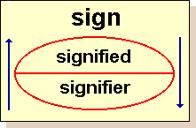
  you cant have the signifier without without the signified.

signifier - open sign, in a shop

signified - the shop is open

'seeing comes before words. The child recognises before it can speak' (berger, 1972)


In order to understand how visual communication works, we need to consider the mechanics of visual language.


As consumers of visual art and design we have become sophisticated ‘readers’ of visual signs and signals.

We consume and decode meanings in visuals almost unconsciously.
Advertising and branding arguably relies on this in order to be successful.

It is important for us as artists and designers to have an understanding of how meaning is formed in order to develop our own visual language within the wider context of visual communications.


Friday 24 February 2012

Appropriation

Appropriation is a term used in the art world that describes the taking of parts of other peoples work and including it in your own. this raises the argument of plagiarism and of how much can you take before it is stealing and is no longer your own work but a mangled piece of other peoples work. i think that appropriation is ok to an extent. i do a lot of digital painting and i will use stock images as reference for my painting, i always get the stock holders permission and i make the image my own, i don't actually add their photo to my work, in my eyes that is the same as me going out with a pencil and pad and drawing a building, surely the architect could say ive appropriated his work in my piece of art.

ill just leave it with a quote by steve jobs ' good artists borrow. great artists steal'

Saturday 18 February 2012

Sites of display

Muse Wormiani - cabinet of curiosity reflected power of collectors

Galeria Milan - industrial - based on Passage des Panoramas - Paris 1799
Leeds victorian quarter - 19th century iron and glass roof - Barrel vault.


"All that is said melts into air"
Use value- is it doing its job?
Exchange value - what is it worth?

Neo Avant Garde practices 1960's onwards.
Sophie Calle - collects in cabinet - updated.

Friday 17 February 2012

Quiz


  • What was the name of the famous international photographic exhibition of the 1950's that showed images of life and work from around the world? Family of man
  • Who argued that beauty is in the eye of the beholder? Immanual Kant
  • What is an isotype? Symbol/image thats not culturally specific.
  • In what year was the festival of britain? 1951
  • What was the significance of the helmet in the festival of britain logo? Britania/ Roman empire
  • In what decade was the first photograph taken? 1820's
  • What is an indexical sign? Shadow / smoke - indicates something was there.
  • Who coined the phrase 'form follows function'?Louis Sullivan 
  • To which country did the futurists belong? Italy
  • What was the name of the building in which the great exhibition was held?Crystal Palace
  • what dates marked the beginning and end of the modern period? 1860-1960
  • What was Haussmanisation? Rebuilding of Paris
  • Who reffered to his typography as 'words in freedom'? Marinette
  • To which art movement does the idea of automatic drawing belong?Surrealism
  • Saturday 11 February 2012

    Festival of britain 1951


    Designed by Abraham Games the logo was used all over. 
    After war everything was black with coal - festival was designed to be colourful and bright.
    A lot of contempory art was included such as sculptures to help people to look to the future.

    Friday 10 February 2012

    YSP


    Today we visited the YSP, honestly i didnt enjoy it. I like sculpting when the sculpture has been made with skill, i dont like all of this modern crap, its the same as when you go in a gallery and they just have a dog shit on a podium, it isnt art. A painting where you look at it and you cant comprehend the level of skill the artist possessed is art. Painters used to be masters now they stick a shark in a formaldehyde tank and call it art, its stupid, firstly Damien hurst how many times are you going to put something dead in a tank and rape millions from galleries for it! dont get me wrong Damien hursts paintings are actually really good, i just dont agree with the shark or the sheep one or that life cycle of the flies thing he did, its just disgusting. he didnt catch the shark, he didnt build the tank, he didnt preserve the shark, he just named the piece then sold it for MILLIONS, that isnt art an artist should be involved in the process of making his art for gods sake. anyway back to the sculpures, im sure there is a reason that the 'artist' for want of a better word, made them. i just dont 'get' it, i suppose the rusty tin can at the bottom is probobly protesting recycling and global warming and that sort of nonsense but honestly there are better ways of protesting recycling than making a crushed can and leaving it in a sculpture park in the middle of yorkshire! the running man looks like a cheap anthony Gormley to be honest, i think it looks unfinished. A shirt in the middle of a field, why!? what possible message is that supposed to give out?
     some giant red childrens blocks, maybe it is saying something about as you grow up dont lose your childishness or maybe you should play more, which in itself is a very true statement but when the sculpture giving that message has a sign near it saying do not climb the sculpture i find it quite hypocritical, maybe that one is just me though.

    finally the plate with the chicken feet on it, i like it. its nice plain simple, its a dinner plate with chicken on it, made me want a roast dinner. the graphics on it are clear and precise.

    all in all i wasnt very pleased with the YSP, half of the sculpures had been moved, we had to walk through muddy fields in bloody winter And to top it off the cafe was extortionate! 


    Friday 3 February 2012

    Avant Garde

    The avant-garde falls within the modern period and it too is concerned with modernization (industrialisation / technological change) and modernity (cosmopolitan, everyday life) – but it is at odds with modernism (functionalism / unity/ art for art’s sake). 


    One of the hallmarks of the avant-garde is ‘discontinuity’; hence it requires an active rather than passive participation of the spectator.

    We also noted that the period after 1960 is generally referred to as the post-modern. If an avant-garde practice can be said to continue after 1960 it is referred to as the neo-avant-garde.

    Paris
    This view of Paris shows the long straight and wide boulevards that radiate from key points in the urban landscape. This characteristic plan is the result of Haussmannisation. Paris in the early 19th c was prone to cholera outbreaks that devastated the population. The principal cause of these outbreaks was the sewerage system that poured foul water upstream into the Seine. The rationale for Haussmann’s plan was clean water. But there was another political motive – the suppression of revolt.


    Sunday 29 January 2012

    pull the plug


    The finished piece, im so happy with this! i wish i hadnt doen that stupid bared wire bit on the cable it looks stupid. The concept behind this is she is a cyborg/ robot and she is pulling the plug out of her head which is actually hurting her, hence the oil pooring out of her.

    Saturday 28 January 2012

    Work in progress digital illustration


    A new work in progress, im actually really excited with the way this one is going, it could be the best one yet.

    Friday 27 January 2012

    Modernism

    Roughly 1860-1960 was the modern period


    Pre-modern - Traditional
    Post-modern - roughly 1960's - turning point


    Crystal Palace (1851) year of great exhibition
    Joseph Paxton - based on greenhouse
    Pre-fabrication - factory produce elements for building so it is cheap and can be taken down and re-built easily.
    Modernism attempts to be universal.

    1860's beginning of modern Paris. All got re-built to accommodate commercialistation.
    • Capitalism
    • Commercialisation
    • Comodity 
    All kicked off by French revolution and industrial revolution.
    Modern - about the present rather than the past.

    Thursday 26 January 2012

    Medusa


    My first illustration since the tshirt design, i think im starting to figure it out now. its the same principle as painting traditionally only in some respecs a lot easier but in other respects a lot harder. i used natalie portman as the model for this not that you can tell who it is.

    leonardo

    Wednesday 25 January 2012

    Brief 4


    You are required to produce the following;
    1. Research a variety of serif, sans serif and hybrid fonts, their histories and usage.
    2. As a team gather/collate and present in an A3 format a body of typographic research in response to being allowed access to the Fred Aldous designs archive. 
    3. Individually create ONE serif OR non serif OR hybrid full font in both upper and lower case including numerals 0 to 9

    Guidance notes;
    The font must utilise, as it’s starting point the Fred Aldous designs archive.
    The font has to support and be sympathetic the logo/branding mark of the company.
    One of the key functions of your font design is that it will be implemented on in store signage/store map and potentially packaging.
    Consideration of the fonts used on the company website is crucial and must form part of your research as your font will be used in conjunction with the existing companies branding.